Sean Colgrave, Tattoo Educator and Curator
May 25th, 2026
Red, Blue, and Bold as Hell
The design DNA of American Traditional tattooing.
Before tattoos were curated for social feeds, they were made fast, bold, and meant to last — not on screens, but on skin. Long before tattooing became a polished global industry, it was a blue-collar craft carried out in ports, barracks, carnivals, and back rooms. It valued permanence over perfection.
American traditional tattooing was built from need. Thick lines, loud colors, and simplified motifs were engineered to survive sweat, saltwater, and sun. They weren’t “retro” quite yet, but rather revolutionary.
When Ink Met Industry
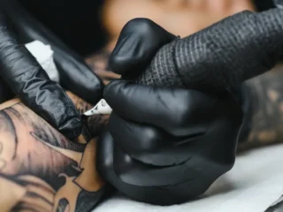
Modern tattooing truly shifted in 1891 when Samuel O’Reilly patented the first electric tattoo machine in New York City, adapting Thomas Edison’s autographic pen. Overnight, the craft changed. What had been slow and physically punishing became faster and far more consistent. Artists could suddenly make work that simply hadn’t been possible with hand tools.
Throughout the early 20th century, the machine was constantly reinvented. Electromagnetic coils replaced O’Reilly’s rotary mechanism, giving rise to the forebear of today’s coil machine. One coil became two, frames were rebalanced, springs tweaked, armatures re-angled. Some early rigs were so heavy that artists suspended them from ceilings with counterweights, just to get through a full day’s work.
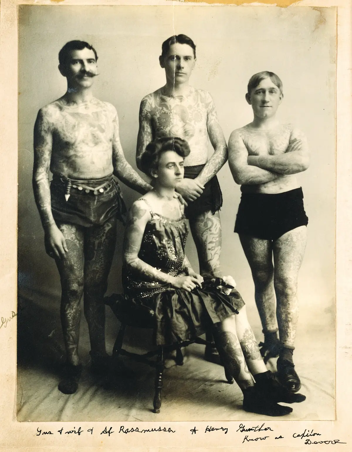
As tattooing travelled through industrial port cities and across the American West, it became inseparable from the working-class world: dockers, miners, railroad men, factory hands, and especially sailors. Tattooing didn’t just follow these people; it belonged to them.
Long before a codified American style existed, tattooing at sea spread imagery across oceans. No one knows exactly when Western sailors began tattooing themselves, but by the 18th and 19th centuries, tattooing was entrenched in maritime culture.
Some designs recorded achievements; others were rooted in superstition. The famous rooster and pig on the feet, for example, were worn to protect sailors from drowning. The real reason chickens and pigs often survived shipwrecks was the buoyancy of their wooden crates, but myth travels faster than fact.
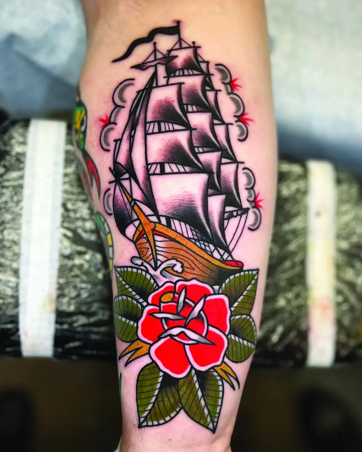
In the merchant navy, service wasn’t marked with medals unless you requested one, so tattoos became the sailor’s CV. A dragon signaled time in the South China Sea; a fully rigged ship marked a successful journey around Cape Horn. Within seconds, one sailor could read another’s experiences, skills, and losses.
In the 1920s and ‘30s, cities like Long Beach, San Diego, and Honolulu had become tattoo capitals, each shaped by the constant churn of servicemen and the creativity of the artists who worked on them. Here, the visual language of what would become American Traditional took form.
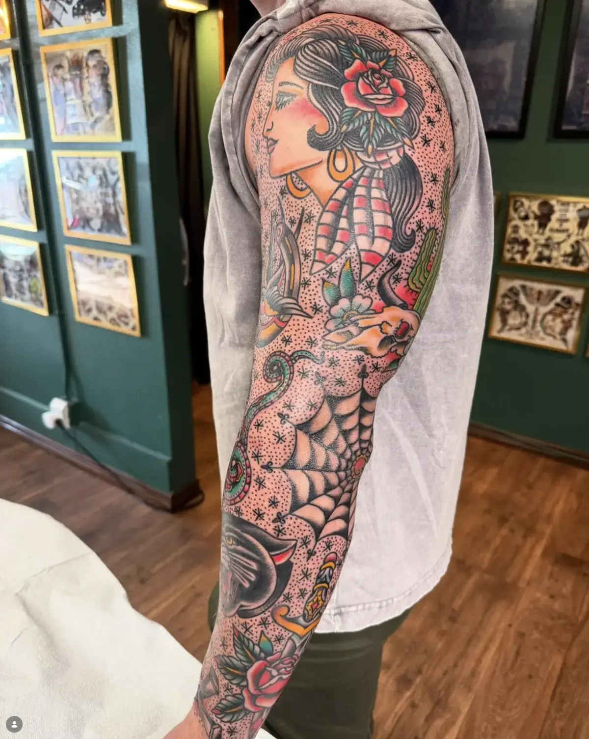
The Blueprint of Bold
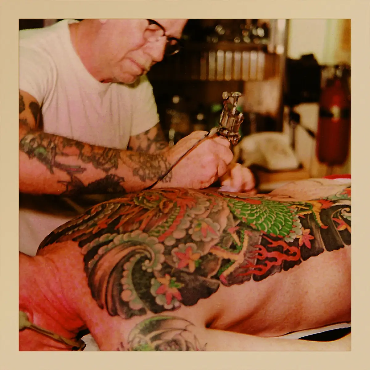
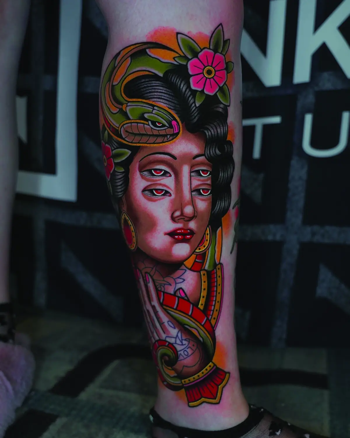
Mention “American Traditional” and certain names rise immediately: Bert Grimm, Sailor Jerry, Mike Malone, Lyle Tuttle, Ed Hardy. Many learned from travel, especially through Asia, adapting dragons, tigers, waves, and motifs sailors admired but couldn’t sit multiple days for. Rough copies were made aboard ship: something quick between ports, something to mark the journey.
Tools were primitive. Needles were carved bone or repurposed rigging needles, hence the thick lines. Colors were whatever could be made: carbon scraped from the inside of a lamp, gunpowder in a pinch, Indian ink if you were lucky. These limitations weren’t stylistic decisions; they were the conditions that created the style. Colors used at that time — likely entirely coincidentally — were the natural dyes of products used to waterproof sailcloth; ochre makes a lovely yellow or red dye, and tannin is a nice brown.
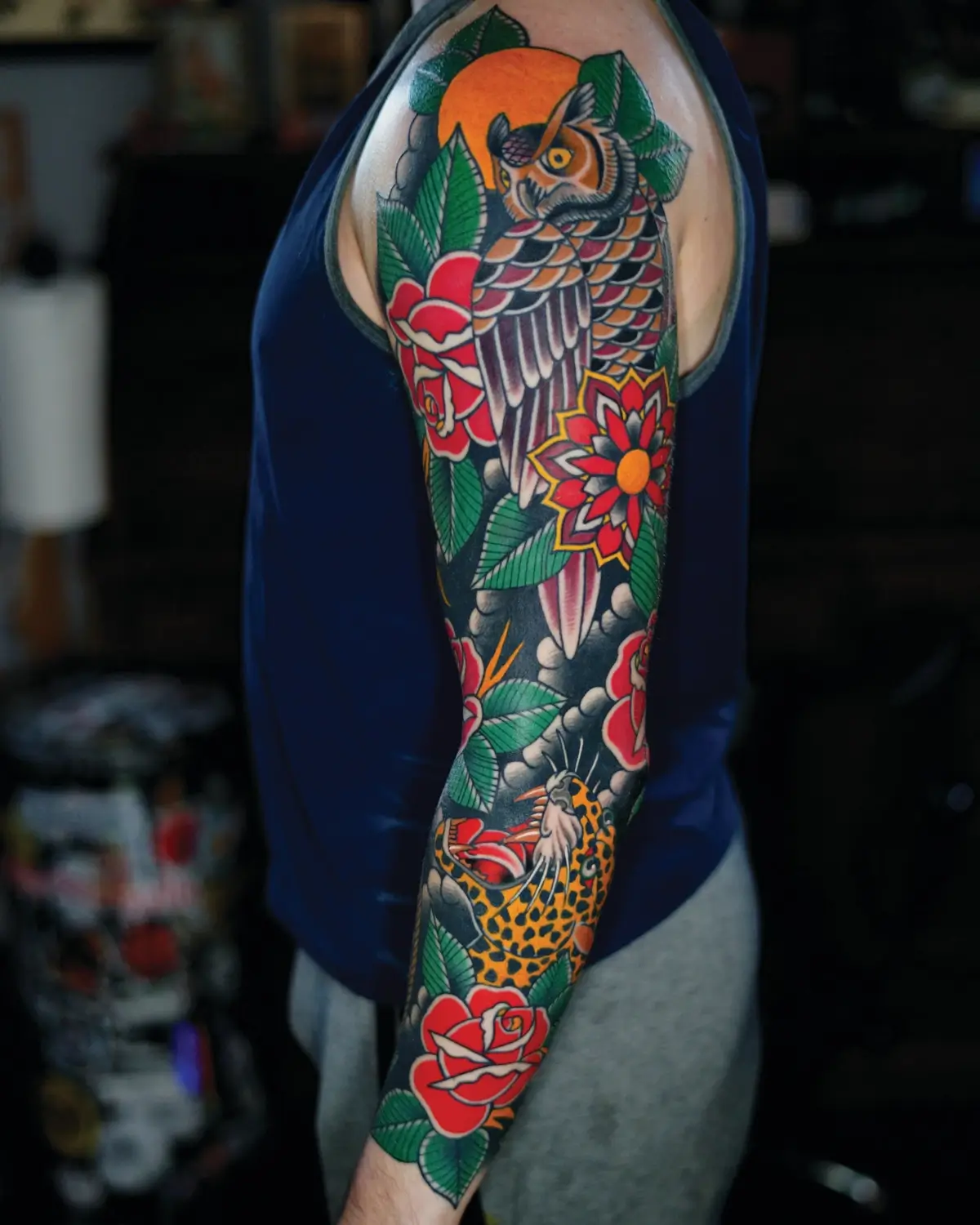
Early tattooers were essentially chemists. Pigments came from sign paint, boot polish, or powdered dyes mixed in whiskey bottles. A good red or blue was prized. Red held up under the sun. Blue gave contrast. Black was everything.
Sailor Jerry’s experiments with purple weren’t for novelty; they were about control. His blends created depth without muddying the design, forming part of the color language we now recognize as classic Trad.
Eventually, manufacturers produced inks specifically for tattooing. Pigments stabilized. Blacks stopped healing blue. But the early palette is still the backbone of the style.
The Shape of Tradition
Flash, even in its name, speaks to the tempo of early tattooing. Some say the term came from tattoos being done “in a flash.” Others claim it referred to how quickly an artist could pack up and disappear when police came knocking.
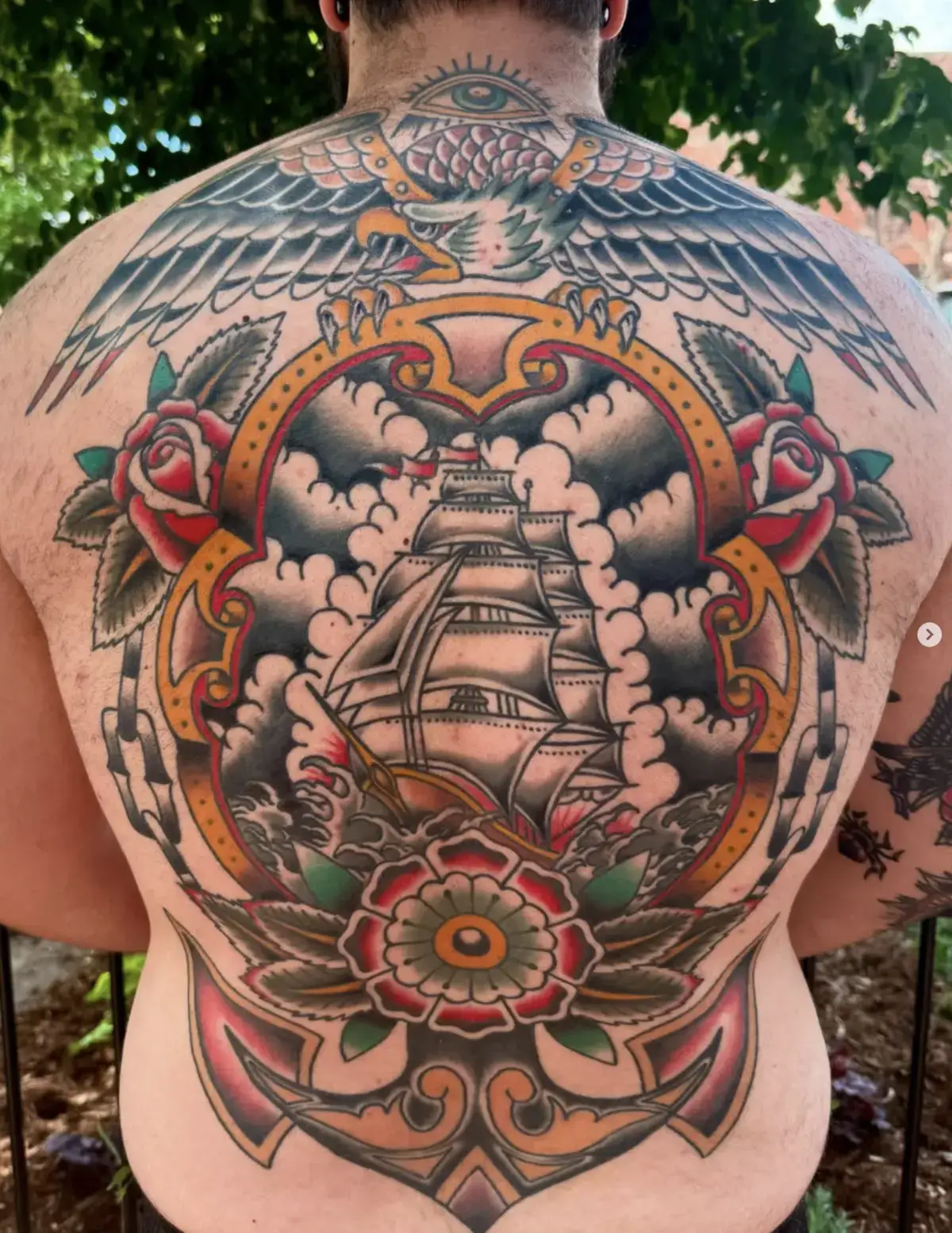
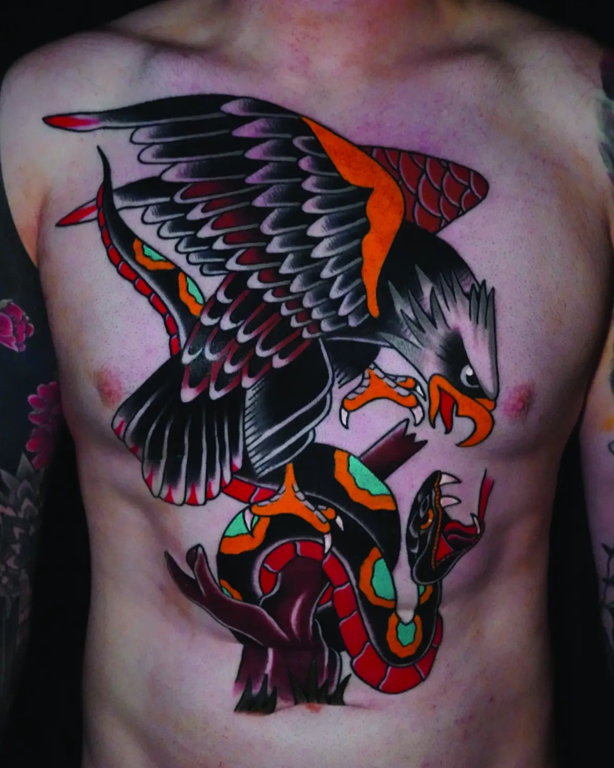
Either way, flash was practical. Sheets hung on shop walls, each design priced for speed and clarity. You didn’t customize — laser removal didn’t exist — so you picked a design and stuck with it.
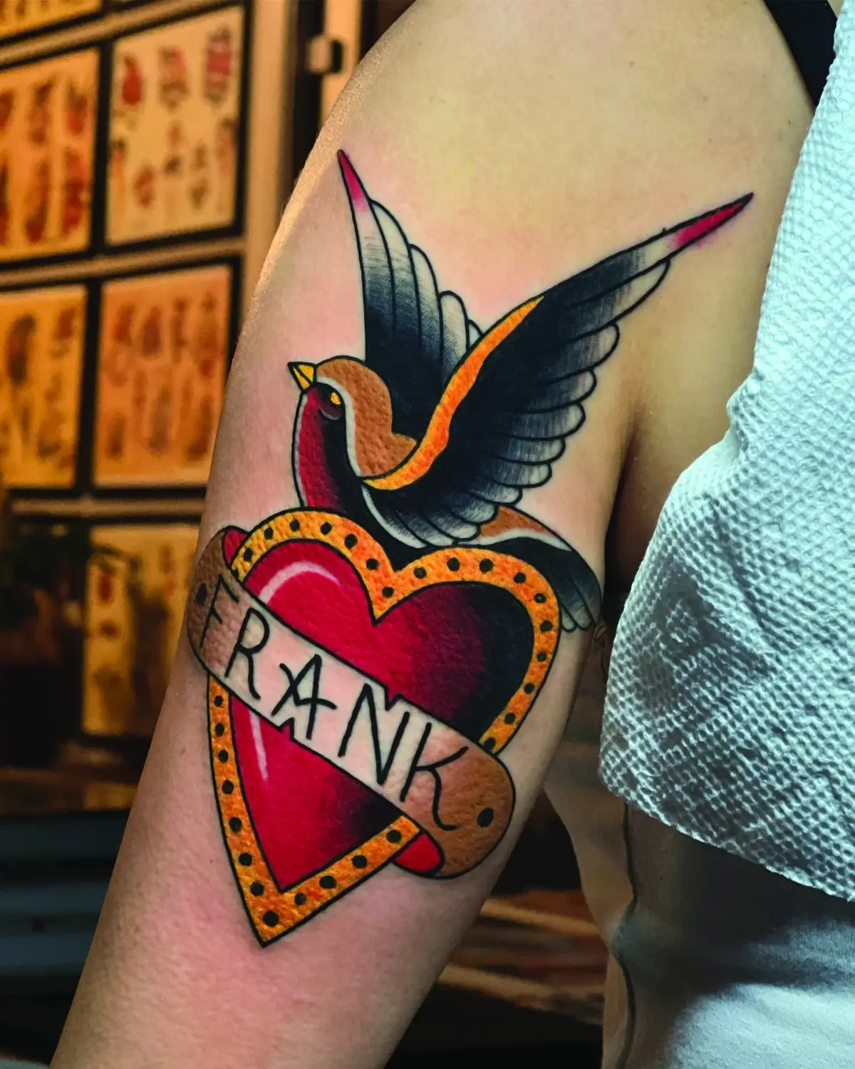
Flash was a visual lexicon. A dagger through a heart meant loss. A swallow meant safe return. A panther meant aggression. Or maybe it meant nothing more than “the artist drew this well, and the client liked it.” In a world with limited literacy and time, pictures did the talking.
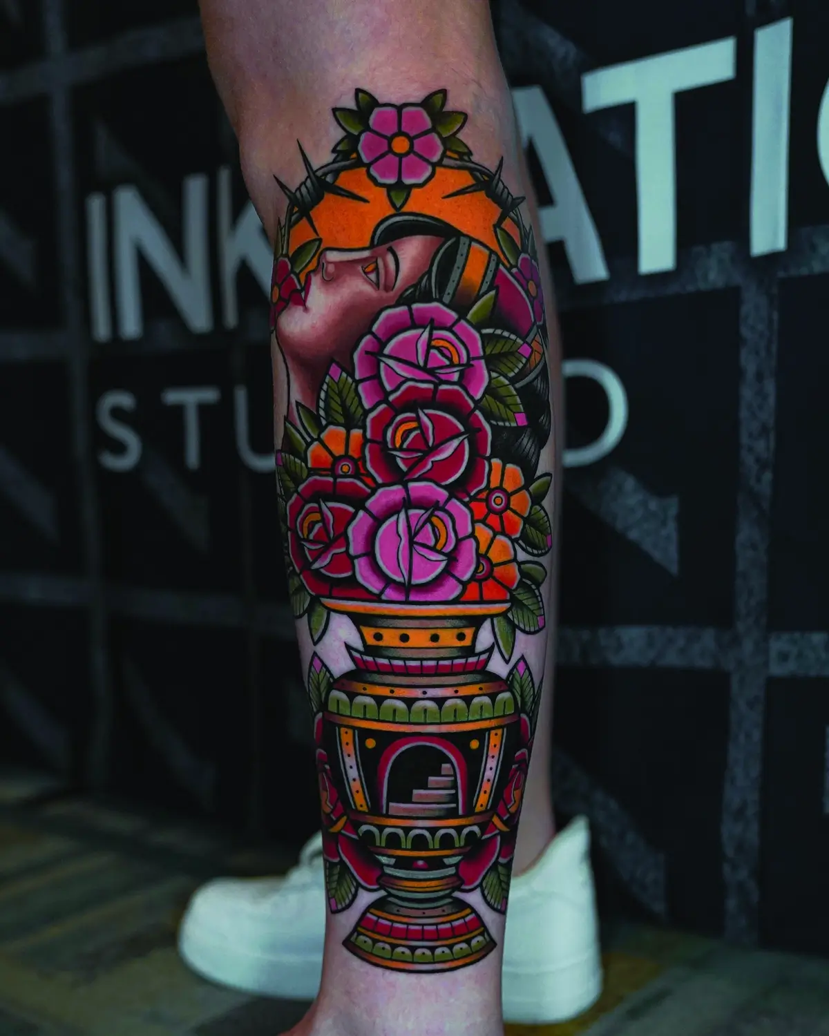
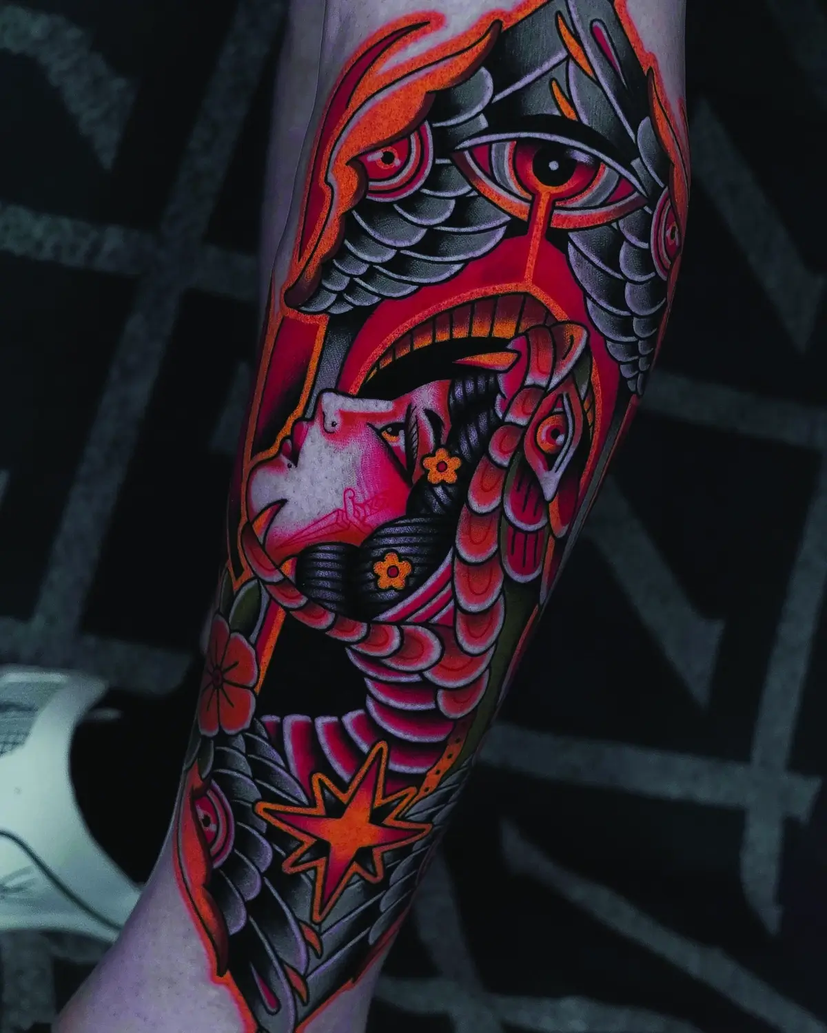
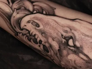
Trad design thinking is sometimes misunderstood as simplistic, when in reality it shares logic with Cubism and early modernism: reduce an object to its essential shape so it reads instantly from a distance.
A rose wasn’t a botanical illustration; it was a rose distilled. Thick outlines locked in color, and empty space created structure. Anything unnecessary was removed because unnecessary things blurred. This is why a 70-year-old swallow tattoo, faded and softened, is still instantly readable. But print a high-fidelity portrait at palm size and step back across the room — the detail is lost. Tattooers understood the medium intuitively: art must live on moving, and aging flesh has different rules.
From Pride to Rebellion
Early tattooers scavenged heavily from the visual world around them: advertising, comics, military insignia, postcards. Anchors came from naval emblems. Eagles from Harley-Davidson ads. Kewpie dolls from Rose O’Neill’s illustrations. Tattooers clipped, simplified, and redrew what resonated.
Originality wasn’t the point. Function was. A design was repeated because it worked, and repetition built a shared language across port cities. By the 1940s, Trad flash was everywhere, but each artist’s hand shaped the work differently. It was folk art: vernacular, mobile, and rooted in working-class identity.
World War II embedded tattooing into American identity. Servicemen wore badges of courage, faith, and belonging on their skin. Tattoo shops thrived around bases, and some, like Sailor Jerry’s in Honolulu, became cultural landmarks.
After the war, conservatism pushed tattoos underground. What once symbolized camaraderie became associated with outlaws and bikers. Then, in the 1960s and ‘70s, artists like Tuttle and Hardy brought tattooing into pop culture. Seen on musicians and outsiders, the designs became emblems of freedom.
Still Bold, Still Breathing
Walk into any tattoo shop today and you’ll still see those reds, blues, and yellows. Flash may be digital now, but the language remains unchanged. The anchor still means stability. The heart still means love. The panther still means ferocity — or maybe you just really love cats.
American Traditional endures because it’s honest. It was never about trend. It was about clarity, connection, and the stubborn desire to be seen, even if only by the people who understood.
The artists who built this style didn’t just create designs. They created a way of thinking: Make it simple. Make it readable. Make it last. Because the best tattoos aren’t the ones that look new — they’re the ones that tell the story of the person wearing them.
Editor's Picks
More From Culture
The Tattoo Artist Who Thinks Like a Sculptor
July 22, 2026
When Tattoo Artists Tell the Truth Over Tequila
July 21, 2026
“ONE OF ONE”
July 20, 2026