Inked Mag Staff
March 1st, 2023
Art From the Heart
John Westbay gives a fresh take to a beloved symbol
By Johnny Watson
Hearts are among the most ubiquitous images we see in our daily lives. From playing cards to emoji to the chalky candy we pretend to enjoy eating on Valentine’s Day and the I Love New York shirts hawked in Times Square, hearts are everywhere. And that’s what makes John Westbay’s art so striking—he has made an image every human recognizes his own. We spoke with Westbay about his distinct calling card, his love for graffiti and much more.
Do you remember when you fell in love with art?
I think I first fell in love with art as a child. From elementary school through high school I have memories of being in class, drawing with my pen in every notebook, in every textbook and on every desk. I’d be in my own world, not paying attention to what was happening in class, completely immersed in whatever it was I was drawing. I don’t think I fully understood it then, but that’s what I love about painting and the creative process in general. It’s the greatest escape and the most powerful connection at the same time.
When did you know you wanted to become an artist?
I’ve always looked at life through an artistic lens, from the time I was a kid. But I started painting in February 2013—I was 23. I had a business at the time and I truly didn’t believe it was possible to earn money from painting, but I didn’t care. The desire to continue painting and exploring was so much more powerful than the desire to earn money. Luckily for me that part just followed.

What was the first medium you worked in?
My first medium was definitely ink on paper… and NYC public school desks [laughs]. But professionally I look at street art as the beginning. It’s really what made all of this possible, so I guess to answer the question, spray paint on brick and mortar.
Can you tell us the origin story behind the heart you feature in much of your work?
I was in the shower, drawing with my finger on the foggy glass shower door, as I always do, and I wrote the word Love with a heart as the O, which you see often on cards and stuff like that. I looked at it and realized the shape of a heart resembles a letter V more than an O, so I wrote it again with the heart as the V. Then I wrote it again with a heart as the V and a peace sign as the O. Then I wrote it again and again and again. It was simple but I really liked it. I started immediately tagging it, all over Brooklyn at first and then the five boroughs. I was obsessed, it was so much fun, I would go out late at night, my heart would race as I walked up to each wall, it was great. Ten years later, I still use the LOVE. It has become my signature, but somewhere along the road, the heart, which simply represented the letter V, grew a pair of eyes, took on emotions and a life of its own. I can’t say why or how, it definitely wasn’t a conscious decision to turn the heart into its own character. It’s not one character—to me they’re always different. They’re different colors and shapes, some seem happy, some sad, some broken, some have pupils, some don’t. I think more important is the way they come together to tell a story. To me they represent myself and the people I see, my fellow New Yorkers—different shapes, different colors, different sizes that seem separate but are all part of one bigger thing.

Why do you feature a similar motif so often? Does it ever get tiresome?
I think it’s important for an artist to be consistent, idiosyncratic, this is how we are recognized. We know a Picasso painting when we see one, a Van Gogh, a Basquiat. We know a Led Zeppelin song as soon as we hear it. Young artists jump all over the place, experimenting, which is valuable and important, but the goal should be to find something and run with it—your own voice, your own style. It evolves over time, slowly it matures, you refine it and it gets even better. If you truly love it, you don’t get tired of it.
With most of your art having such a positive message, what are you hoping to convey to people as they experience your work?
Unfortunately there is a trend for an artist to use a lot of bullshit in their work because they think it’s cool. LV logos, Chanel logos, pictures with their paintings in front of Lambos or Ferraris. What’s your message? What are you really trying to convey? I hate it. Maybe that’s genuinely what they’re into and what’s coming out of them, but I feel like it’s a cop out. An easy way to latch onto something that’s already been made “cool.” We are artists, we make shit cool! I refuse to do that, I’m very conscious of the message I’m conveying and I’m proud of that. It’s not always easy to make something with such a positive message that’s also really dope and desirable. It’s easy for art or music with a positive message to be seen as cheesy. Really finding that balance of positive and dope is definitely my goal, and when I feel like I have achieved that with a certain piece or project is when I feel most accomplished.

Can you tell us the differences in your process when painting on a canvas versus a mural or street art?
I really enjoy both, both are very important to me. Working on canvas because it is something that will be cherished and preserved and hopefully be around for way longer than myself. And murals because they are going to be seen by so many people. It won’t last forever, but while it’s up, it’s up for everyone, 24 hours a day, no hiding. Honestly, I prefer the process of painting on canvas, with a paint brush, in my studio, my space, my music, everything there for me, where I need it. That’s definitely where I feel most comfortable and most connected. Murals are a lot of fun, but really it’s less about the process and more about giving the finished product to the people.

Editor's Picks
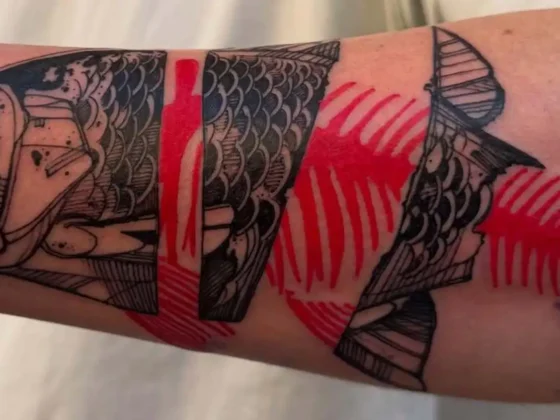
Bridging Classical Art and Modern Tattooing
Esteban Rodriguez brings the discipline of classical fine art to the living canvas of skin, creating hyper-realistic tattoos that merge technical mastery with emotional depth.
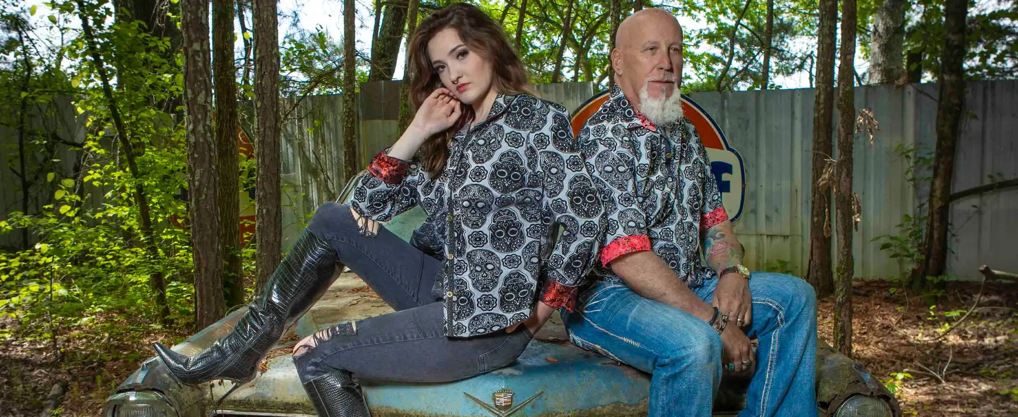
Show Your Ink Fashions Brings Custom Style to Tattoo Culture
Show Your Ink Fashions creates custom shirts designed to showcase your tattoos as wearable art, blending fashion with personal expression.
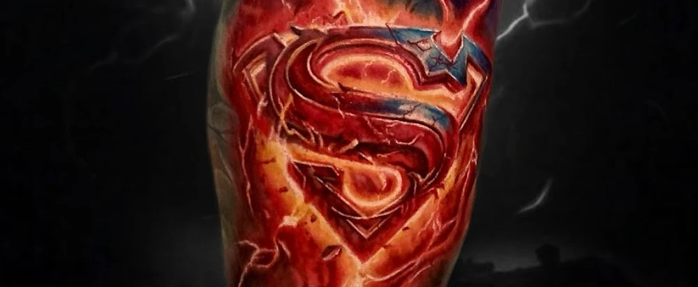
The Ultimate “Superman” Tattoo Roundup: Just in Time for Superman’s Return to Screens
With Superman’s big return to theaters, fans are revisiting some of the most iconic ink inspired by the Man of Steel.
More From News Content
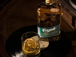
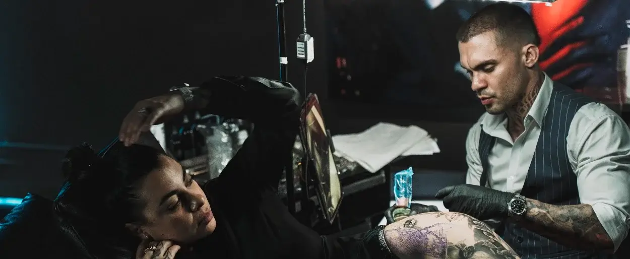
When Tattoo Artists Tell the Truth Over Tequila
July 21, 2026
“ONE OF ONE”
July 20, 2026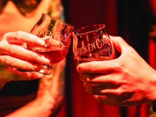
Legends Unite
July 14, 2026