Inked Mag Staff
July 8th, 2020
Color Outside the Lines
Shooby breaks down blending color with black-and-grey and mastering realism.
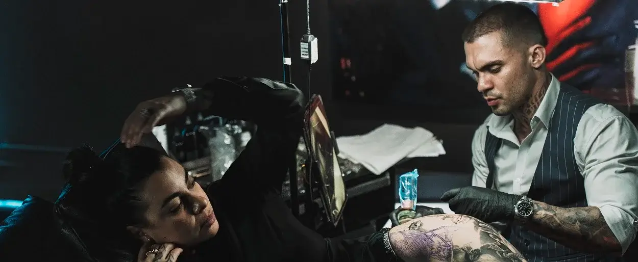
Want a pop culture tattoo that pushes the bounds of the imagination? Look no further than Sébastien Coston or, as Instagram knows him, Shooby. Shooby honed his craft in the suburbs of Paris and has won the world over with his impressive approach to color realism. Over the last decade, Shooby has not only mastered black-and-grey and color realism, but sets himself apart from the pack by expertly blending the two styles into one tattoo. We caught up with the talented tattooer to learn how he’s perfected his techniques over time and why he’ll never stop hustling to create better tattoos for his clients.
What was the first tattoo you did and how did it lead you to becoming the artist you are today?
My first tattoo was done on my wife’s youngest brother 11 years ago, when my wife was on a trip to Argentina. I had just bought a machine from a friend who was a tattoo artist, and he gave me some advice about tattooing and told me about all the rules of hygiene. So, I asked my brother if he wanted my first tattoo and he said, “Ok, my brother.” I tattooed him on the table in my living room and did a Roman numeral VII on his right buttock, which took two hours to do. I shared the photo of my first tattoo on Facebook and my wife was surprised to see that her boyfriend tattooed her brother on the living room table. Since that day, I had only one desire and that was to tattoo again (and again). I retried that adventure and it’s what made me the artist I have become today. From the start, I’ve only been looking to continue the adventure.
What is the tattoo scene like in Paris?
I work in Lagny-sur-Marne, which is 25 minutes from Paris and 10 minutes from Disneyland. In Paris, there are a lot of tattoo artists with varied styles, like in many big cities. There aren’t many of us practicing realism in or close to Paris, and from what I can see in Parisian salons, they have more demand for black work.
How do you go about combining color with black-and-grey? Where can other artists go wrong when trying to attempt this?
The technique of mixing black-and-grey and color requires strong contrast to make the tattoo beautiful and durable over time. I try to put enough black in the tattoo so that the whole design is easily readable. For the grey, I use a mix of grey wash and opaque grey. The colors are saturated as for a classic color piece.I think people can go wrong with this technique in several ways. Either they don’t saturate their colors enough or they cut their colors with water. As a result, the tattoo will be bland and age badly. Sometimes their greys are also too light, and that will cause a problem because the colors will stand out too much by comparison. To do this technique, you need to understand contrast.
Where do you find inspiration for your tattoos and how do you go about combining contrasting images in a cohesive design?
I find my inspiration for tattoos in films, from the work of tattoo artists I follow on social media, in museums and at art exhibitions. But what inspires me the most are the photos. I try to find the best possible references for my designs by choosing photos with strong contrasts and a good balance between dark and light. Then I combine photos together and try several possible combinations for each project until I arrive at a result that I like. Often I’m lucky I can do something that I like quickly, but sometimes it takes much longer.
How did you learn to draw and then tattoo realism? How long did it take you to master this skill?
I learned to draw when I was young. I drew at school instead of doing the required exercises and was often punished for that. I drew as soon as I could and my mother helped me a lot. She’s a painter who paints realistic still lifes. Before being a tattoo artist, I sold my paintings and when I became a tattoo artist, I tattooed in all the different styles the first years. That taught me a lot technically, such as making beautiful lines, solid black, colors, greys and gradients. I waited five years to start realism. When I felt ready, I started to propose projects to my clients and realized that it was really very complicated to create realistic rendering, especially in color. This type of realism requires a lot of concentration, working days are longer, creating textures is difficult, and it requires a lot of time.
Editor's Picks
Bridging Classical Art and Modern Tattooing
Esteban Rodriguez brings the discipline of classical fine art to the living canvas of skin, creating hyper-realistic tattoos that merge technical mastery with emotional depth.
Show Your Ink Fashions Brings Custom Style to Tattoo Culture
Show Your Ink Fashions creates custom shirts designed to showcase your tattoos as wearable art, blending fashion with personal expression.
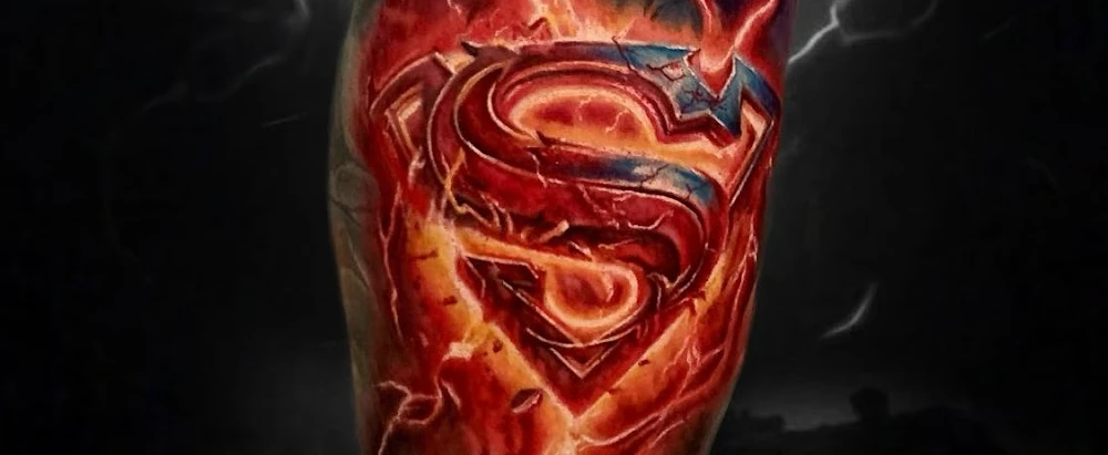
The Ultimate “Superman” Tattoo Roundup: Just in Time for Superman’s Return to Screens
With Superman’s big return to theaters, fans are revisiting some of the most iconic ink inspired by the Man of Steel.


