Inked Mag Staff
January 18th, 2023
The Vibrancy of Words
Malfi proves that a picture made of words tells infinite stories
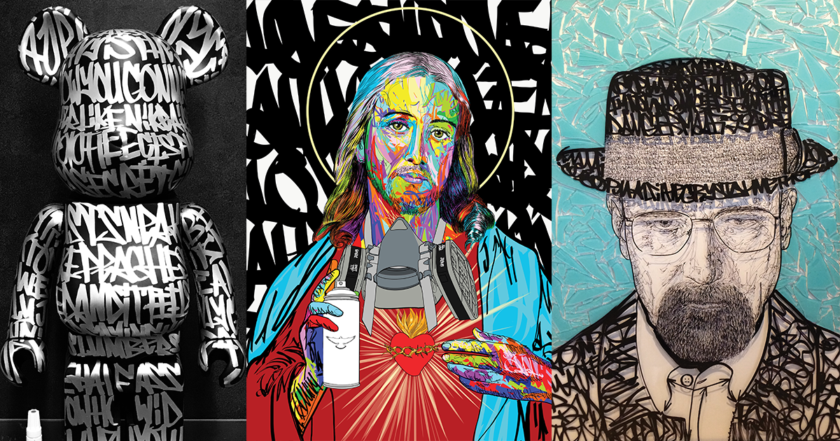
A picture may tell a thousand words, but what can you say if you make that picture with words? Malfi explores the possibilities by incorporating graffiti-inspired lettering into his art. Sometimes the lettering is an accent; in other pieces it is the very foundation. We spoke with the New York-based artist about how he balances artistry and legibility in his lettering, his attraction to vibrant colors and more.
Do you remember the first time you fell in love with art?
No specific moment comes to mind. I always had an appreciation of art and I would try to absorb as many visuals as I could when my parents took me to museums as a kid, so art never felt like it wasn’t part of life.
When did you know you wanted to become an artist?
“As far back as I can remember, I always wanted to be a gangster.” …I mean artist. RIP, Ray Liotta. I think everyone is born with a skill set. I happened to be very lucky finding out what I did best at an early age and even luckier having a mom who cultivated it.

What was the first medium you worked in?
Pencil.
Who are some of your biggest influences?
Growing up, anything Marvel and Disney put out was a big influence. As I got older everyone in style wars and Renaissance artists. I love the work of Hajime Sorayama, Norman Rockwell, LeRoy Neiman, Peter Max and Marc Ecko.
My biggest influence is probably the city of New York. I never really studied any specific artists in great detail but I did get to see a lot of art over the years growing up in New York. As I mentioned before, my parents took me to museums and I remember looking into the gallery’s windows to pass time while my dad went for doctor appointments. Sitting in traffic deciphering graffiti on things is still a favorite.

Why are you so intrigued with lettering?
Letters are vital and fun to manipulate.
Can you speak to the way you balance artistry and legibility in your work?
The words aren’t more important than the overall visual. It’s a juggling act between the two. I like it when things can be read in places and when they cannot in other places. I want to create layers for the viewer. It’s not necessary to be able to read every word, you can still get the message without being able to read it. I compare it to hearing a song you like in a foreign language, you don’t need to understand it to know if you like it, because it makes you feel something.
Your lettering is very distinctive. How did you find your method of doing things? We’re guessing it took a lot of practice to get into a groove.
It’s very important to have an original style. I found mine when I decided to just do what felt most natural.
How did you come up with the idea of working pop culture figures into your lettering?
I’m just combining things I like while showing people the beauty I see in handstyle. In the beginning it was all about that, now I play with that balance on a piece-by-piece basis.

A lot of your portraiture work is reminiscent of LeRoy Neiman’s work. Can you tell us about your love for bright colors? Why do you think they are so engaging
Thanks, I’m a big fan of LeRoy Neiman—I love his use of color. I remember the first time I saw his work not knowing it was his, I was maybe 6 or 7 years old. He did the album artwork for a Frank Sinatra Duets CD that my dad had and the color placement stood out like nothing I had seen before. That’s when I learned coloring inside the lines didn’t matter.
Bright colors represent fun, youth and danger. They make you feel alive. I’ve always been attracted to bright colors.
Who are some of your favorite subjects to revisit?
Most of my work is commissioned-based, so a lot of the repetitive subject matter is a reflection of my clients. I prefer to not paint the same thing twice.

Tell us a little about your NFTs and how this has changed things for you as an artist. Given the volatility we’ve seen in the past six months in the cryptomarkets, do you think NFTs have long-term viability?
I’ve always been analog over digital, so it hasn’t changed too much for me. It’s a new way for digital art to be collected and appreciated. I feel they will be here for the long term.
Where do you see the next evolution of your art?
I want to create larger pieces focused more on emotional impact and storytelling. Over the past decade I’ve created so many pieces based mostly on subject matter upon request. I love the collaboration, but I have ideas I want to express and in the future I plan on exploring these paths more frequently.
Editor's Picks
Bridging Classical Art and Modern Tattooing
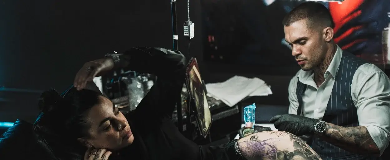
Esteban Rodriguez brings the discipline of classical fine art to the living canvas of skin, creating hyper-realistic tattoos that merge technical mastery with emotional depth.
Show Your Ink Fashions Brings Custom Style to Tattoo Culture
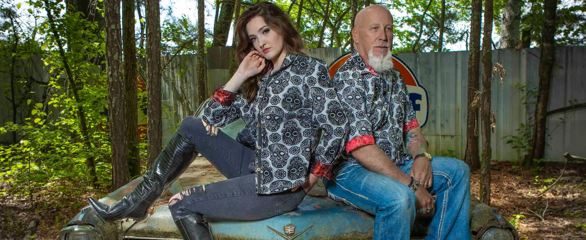
Show Your Ink Fashions creates custom shirts designed to showcase your tattoos as wearable art, blending fashion with personal expression.
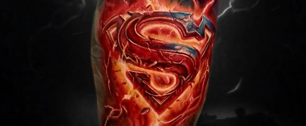
The Ultimate “Superman” Tattoo Roundup: Just in Time for Superman’s Return to Screens
With Superman’s big return to theaters, fans are revisiting some of the most iconic ink inspired by the Man of Steel.
